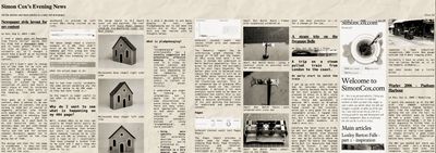
Newspaper style layout for my content
I read a short post on Mastodon from Pierre Carrier saying that his blog had a newspaper mode - and it looks great! Pierre has his site on 11ty, as my site currently is, so I thought I would have a quick go at building a newspaper version of my content - the Simon Cox Evening News.
First off I didn't want to change any of the code for my site and this would be on one page only - not a toggle between site designs. 11ty automatically builds collections to gather content into groups so with testing I picked my Shorts collection of posts and built a small piece of html to reiterate over each story - that pulls in the heading, link and content etc.
This gave me a long page of content. What I wanted to do was have columns of content. CSS grid sprang to mind but of course it segments articles into blocks with spaces in the rows, so that would not work. A masonary type approach might work - but that runs in rows. So I went back to an old favourite that, in my opinion, does not get used enough on the web - columns. This is really old CSS and for various reasons designers appear not to like it - control of the flow being one of them.
The design and html for the page is standalone - it does not uses any of the CSS or templates from the rest of the site.
I had some issues:
- Initially I set media breakpoints for the number of columns to give a responsive layout depending on viewport size. Pierre rightly asked why I had not set the column widths and he was spot on - that was a much better approach.
- Image widths had to be set to width of 100% to fill the column correctly but some were smaller than the columns widths so Max-width 100% was used.
- I was getting a lot of white space to the right meaning there was a lot of horizontal scrolling which was not great. I eventually tracked this down to the pre tag, that I was wrapping code in, needing white-space: pre-wrap; in the css.
- I had used the Shorts collection to test and swapped that to my posts collection to do a second test. What I really wanted to do was both and I thought I would have to set up a new filter in 11ty to do that bet remembered I have already done this for the rss feed – so I was able to use the feed collection! 11ty does make this kind of thing easy!
Once I had the layout sorted I added some enhancements.
- The images and links were in colour and I wanted an old newspaper feel. I added filter:grayscale(1) brightness(80%) contrast(150%); mix-blend-mode: hard-light; to the container making everything monochrome without touching the source content.
- background - a seamless crumpled paper image.
- post titles were set in Playfair Bold and the kerning tightened.
Things to do: I was hoping to add some filters to make the images look like halftones but after a lot of experimentation it has eluded me. There are some lovely online codepens and blog posts on halftones for this but I could not get them to work without changing the posts underlying code. I may come back to this in the future.
As Seth Goldstein said It's overwhelming but he is a recovering journalist.
Anyway - here it is - the Simon Cox Evening News.

Update
15 Sept 2024
I have added a couple of extra pages that filter the Articles and Short articles so it is a little bit easier to read. Not sure this will have a huge amount of traffic as it is more of an excercise! I am, of course, monitoring what happens from an SEO aspect - always testing!
Next short: 11ty upgrading node in netlify
Previous short: Home network set up changes


